Building a data-driven event strategy for your community
Want to know a wild stat? It turns out, 100% of Platinum communities (the top 10% of those on Circle!) host events—and they host more of every kind of event, too.
But simply 'hosting events' isn't a strategy—that's like saying your strategy is 'publishing posts' or 'creating courses. Strategy is your game plan for getting members to do the things you want (which may include hosting events, engaging with posts, or completing courses), so you can hit your goals now and down the line.
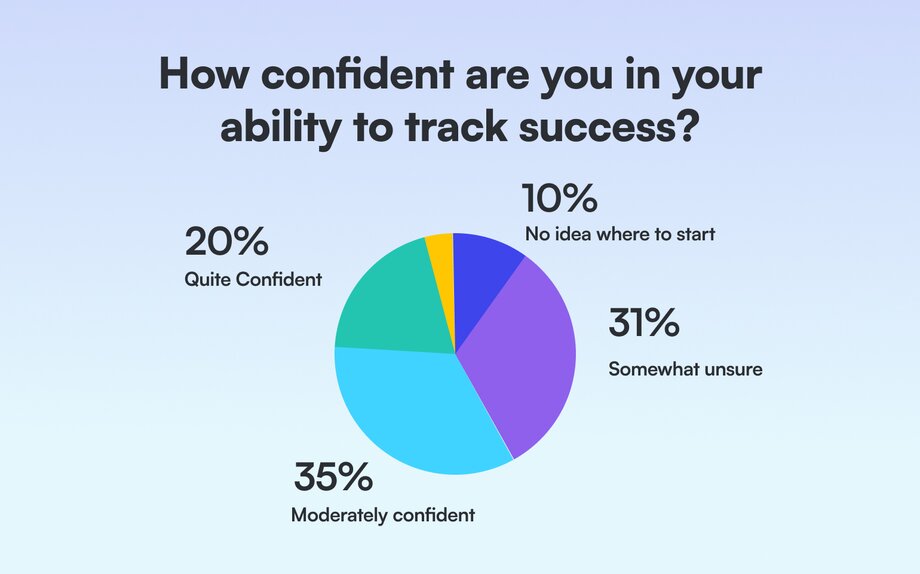
In this guide, we’ll walk through every step of building a data-driven event strategy. And don’t worry if you’re not ‘a numbers person’ either—you’re not alone. Forty-one percent of community builders say they’re somewhat unsure or have no idea how to track their community’s success, and standard creators are 3x more likely than Platinums to say they have no idea where to start.
The only thing you need is innate curiosity to ask the right questions, and you’re reading this guide, you’ve already asked the most important one: How can I create better, more rewarding events for my members?
Relax, we’re going to show you how. It’s even going to be fun!
1. Establish a baseline for your past events
Before developing your event strategy, you need to know what’s been done, what’s worked, and what hasn’t gone as well as you hoped.
Approach this exercise with a spirit of curiosity. Take a step back and jot down some questions you have about your event programming. You might wonder… 🤔
- What types of events are your members most interested in?
- What events aren’t worth the effort you’ve put into them?
- What times and days have historically seen the highest attendance?
⭐ Note: These questions are ‘north stars’ that will guide your investigation and keep your work grounded.
It can be super easy to get overwhelmed by the seemingly unlimited ways you can slice and dice and analyze data. I’m an ‘expert’ (or at least enough of an expert to write this guide) and even I got overwhelmed writing this! These questions will keep you focused and help you to reframe the numbers as clues that get you closer to uncovering answers.
Now, let’s run through the basics of event data analysis:
- Collect your macro data
- Collect your micro data
- Analyze data patterns
- Answer questions
2. Collect your macro data
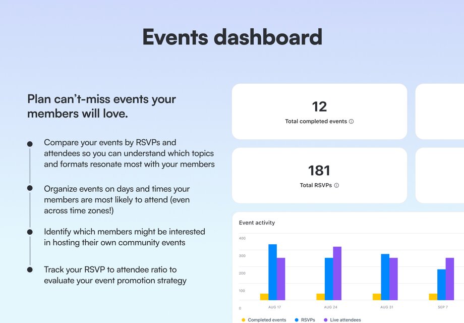
Macro data looks at the big picture like how many events you hosted, how many total RSVPs you received, and how many people ultimately showed up. These metrics show you, directionally, how you’re doing. They’re also the easiest to pull! You can get them right at the top of your events dashboard in Circle.
👋 Circle user tip: For a measure of how engaged your members were during an event, you can also look at the livestream / room messages in your messages dashboard.
3. Collect your micro data
Micro data give you specific, actionable insights, like what type of event topic drives the most RSVPs. Knowing you have 1000 RSVPs isn’t inherently helpful for launching a strategy, though—sure, maybe you want more RSVPs, but you aren’t going to know what to do to get them if you don’t dive into the micro data.
Start by categorizing the types of events you’ve organized over a period of time. If you’re using Circle, you can toggle to your events dashboard > popular events > download data into a spreadsheet.
In your spreadsheet, bucket the events into categories that make sense for you. For example, I’m going to group my events by topic (show and tell, product workshop, etc.) but you could also classify by format (small group discussion, one to many, etc.), or goal (onboarding, engagement, acquisition, and retention).
Think about what dimensions are most important to you. Consider location (virtual, IRL), audience, whether an event was free or paid, etc.
Now, fill these columns out for every event!
💡 Tip: If a particular event did extraordinarily well or otherwise appears to be an outlier, you might want to bucket it separately so you can tease out the impact it had; otherwise, it could skew your results.
When faced with an outlier event, you’ll want to examine what about that specific event was so special – and it might not necessarily be the topic or group it belongs to.
Finally, calculate the attendance rate by dividing the number of attendees by the total number of RSVPs. For instance, if I had 100 RSVPs and 60 attendees, my attendance rate would be 60%.Your attendance rate could even be over 100% if more people attended an event live than RSVP’d to it (great for virtual events, bad for IRL events with limited quantities of pigs in a blanket). 🌭
4. Analyze data patterns
Below is a list of some of our favorite event data pairings that can bring you actionable insights.
# of RSVPs by topic
Shows you what topics or themes your members found interesting enough to express initial interest in and can also reflect how well you promoted the event.
💡Tip: A high number of RSVPs suggests that the topic is engaging or that your promotional efforts were super effective.
# of RSVPs by format
Shows you if your members prefer a specific format over another (like a workshop vs a webinar vs a discussion section).
💡 Tip: A high number of RSVPs suggests that the format is a successful way to connect with your members.
# of attendees by topic
Shows what topics your members valued enough to attend the event live and can also reflect the effectiveness of your event promotion.
💡 Tip: A high number of attendees compared to RSVPs might suggest that the topic was highly anticipated or the event was well promoted.
# of events in each topic
Shows you where you spent the most time and resources in terms of event planning and execution.
💡 Tip: Can help you assess if your efforts are aligned with your community's interests or if you need to diversify your topics.
Attendance rate by topic
Shows you how well you converted initial interest (RSVPs) into actual event attendance.
💡 Tip: A high percentage indicates effective promotion and engagement strategies, while a low percentage suggests there were barriers to attendance (like time of day) or you didn’t promote the event enough leading up to it.
Average number of RSVPs by topic
Shows you an overview of the average interest level for each topic.
💡 Tip: Identify which topics consistently attract more interest, so you can tailor future events to your community's preferences.
Be careful of data pitfalls
Unfortunately, data isn’t always so straightforward. Many have been fooled if they’re not aware of the pitfalls! (Been there, done that).
If you just looked at RSVPs per topic, you might be misled into believing a topic is more successful than it is simply because you overinvested in that topic. It’s better to look at averages or ratios when comparing the success of different events so you aren’t comparing apples to oranges.
For example, let’s say you hosted ten book club meetings with 20 RSVPs each or 200 RSVPs total. You also hosted one game night with 150 RSVPs. On the surface, the book clubs look like they performed better, with more RSVPs overall. But the average number of RSVPs per event is dramatically different (20 vs 150).
Another tip: You’ll have an easier time making sense of your event data if you run recurring events (i.e. you're not just hosting one-off events at an irregular cadence).
5. Answer your questions
One of the best ways to kickstart your data analysis is by asking questions. By starting with a question, you now have a direction and a purpose when sifting through the data. Below are some common event related questions you can ask.
Which topics and types of events are most popular, or least popular?
Look at the number of RSVPs and attendees by topic to identify which themes consistently attract the most and least interest and engagement from members. You may also want to look at the average number of RSVPs by topic to identify which topics consistently generate the most and least amount of interest on a per-event basis.
What commonalities do you see in your most successful events? What about your least successful ones?
Look at individual event # of RSVPs, # of attendees, and attendance rate. Also consider time of day, topic, event length, speaker, promotional strategies, and so on.
How effective are your event promotion strategies?
The RSVP to attendee ratio can provide valuable insights into the effectiveness of your promotional efforts.
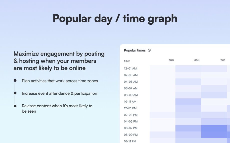
What days / times of days do I get the most member engagement?
Look at the member presence graph in your events dashboard, and consider times that work for the most time zones—even if it isn’t the most active time in absolute terms.
In the Circle platform, we provide detailed community data reports that our customers can dive into, including an events dashboard. This dashboard gives you a really great overview of your event performance.
6. Choose your KPIs
In the previous section, we put together a complete picture of your event programming. This overview serves as both an audit, detailing what's been done, and a diagnostic, highlighting what's been done well and what could be improved. Now, it’s time to define success for your event strategy, and that starts with setting a clear goal.
What are KPIs? KPIs (Key Performance Indicators) are a quantifiable way of measuring how close or far you are from achieving your objective. They help you track progress, make informed decisions, and ensure that your event strategy aligns with overall community goals.
KPIs can be leading or lagging measures:
- Lag measures are the outcomes you ultimately want to achieve, like more members or more revenue.
- Lead measures are early indicators that you’re on the right path.
For example, increasing event attendance at your onboarding events is a leading indicator for improving member retention overall. The event attendance isn’t the end goal in and of itself—it’s a sign that you’re moving in the right direction.
Here are some examples of event-related KPIs:
- Total # of events, # of specific types of events
- Total # of total attendees, total # of attendees who belong to a particular member type, total # of attendees at specific event types
- # of RSVPs, # of RSVPs for specific events, # of RSVPs from particular member types
- Attendance rate, attendance rate at specific event type
It’s important that the KPI you choose actually maps back to your goal. That may seem obvious, but if your goal is to increase the number of members who purchase your premium offering, you wouldn’t want to track the number of livestream messages as a core KPI.
Here are some examples of goals and KPIs that ladder up to meet them. You’ll also want to track how these numbers change over time (so % increase / decrease)!
1. Goal: Increase member engagement (MAU)
- KPIs: Average attendance rate per event, # of events organized, attendance rate, % of monthly active users (MAUs), # of posts in the community after each event, and # of live stream chat messages.
2. Goal: Increase member retention (Churn)
- KPIs: Average attendance per orientation, total attendees at orientation / office hour events.
3. Goal: Increase paid subscriber value
- KPIs: # of paid subscribers who attend events, # of livestream chat messages from paid subscribers.
⭐ Note: You don’t need to care about or track all these numbers! Only the ones that matter to you.
By carefully selecting KPIs that align with your specific goals, you can effectively measure the success of your event strategy and make data-driven decisions to improve your community's engagement and growth.
7. Build your comprehensive event strategy
So you have a goal, and you know how you’re going to track that goal (KPIs). You also know where you stand in relation to that goal today (baseline). Now, it’s time to look at what you should keep doing to get you closer to your objective, what you should stop doing that sets you farther away from it, and come up with some new ideas to try out.
We’re going to put together a strategy using a hypothetical scenario.
Scenario: Community member engagement is down
Goal: Increase the number of active members in your community (lag measure).
Hypothesis: You think increasing event attendance (lead measure) could be a smart way to bring folks back into your community.
Your KPIs might be:
- # of events (to hold yourself accountable to investing in events overall).
- # of RSVPs (tells you if people find your event interesting).
- # of total attendees (tells you if your event holds enough value to drive people into the community).
- Attendance rate (tells you if you’re promoting the event effectively).
Remember, a strategy is the plan you put together to incentivize members to take the actions you want in your community (in this case, it’s attending events so they come back again and again to your community).
Now, for the plan. Let’s run through some questions!
What sorts of events should I host?
- Look at what’s worked before for you to double down on (back to baseline section, popular events).
- To preserve time and energy, stop doing what doesn’t have a high ROI.
- Survey your members to find out what other event types to experiment with. (Hint: use Circle polls!)
How do I drive RSVPs?
- Look at what’s worked before to drive events with the most RSVPs—how did you announce the event.
- Look on the post dashboard for popular posts related to the event topic—promote the event in the comments.
How do I get people to actually come to the event (attendees & attendance rate)?
- Look at your most well attended events before—what did you do differently leading up to the event to promote it
- Look at the device analytics dashboard, if members use more mobile devices to access your community, you might want to show them how to join through the app.
- Who are your top members (member leaderboard)? How can they help you promote the event? Maybe you want to invite them as co-hosts.
When should I host these events?
- Look at the popular days/times graph from your community in baseline.
One downside of analytics is that it can only show you what's worked in the past or what hasn't, based on what you've already done. To get new insights or ideas, you'll need to chat with your members and dig into other data sources.
- Most popular posts—tells you what topics are getting people excited.
- Member leaderboard—consider introducing member-led events hosted by your most active members.
- Ask for help in the Circle community!
Now that you have the strategy, you might be wondering how to best design a great event experience. Well, we have the resource for you: our comprehensive community events playbook!
The best strategies combine data and intuition
There are 3 ways you can develop a strategy:
- Rely on gut instincts
- Apply data
- Blend the two together (ideal!)
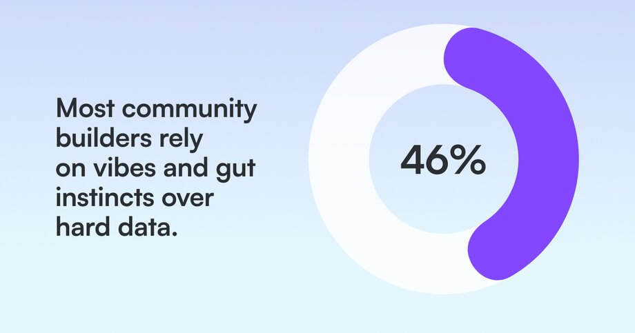
In fact, 46% of Benchmark Survey respondents say they use their intuition to gauge what’s going on in the community.
This makes sense – if you’re working in or on your community every day, it’s hard to believe anything is happening that you don’t know about.
Afterall, you’re the expert on your members' transformation. For example: A course creator will often be able to gauge whether a cohort is doing well based on the quality of the participation at live events, whether members are jumping into discussions, how fast people are going through the material/doing the exercises, etc.
Using your gut isn't bad on its own! But when you combine it with data, that's when the magic happens.
At the same time, a lot of community builders don’t consider themselves to be ‘numbers people’—they got into the industry to foster deep connections, share knowledge, and change lives. Adding numbers to the mix is akin to talking about math at a party (The surest way to be excluded from any future invite lists!).
So, it’s not like they’re really jonesing to add data to the mix, especially if it feels like their gut instinct hasn’t failed them yet.
But is that really true? How do you know you haven’t overlooked any opportunities or ignored any trends because they weren’t obvious to you?
Remember that a community is like an iceberg – a lot of what keeps it afloat lives below the surface.
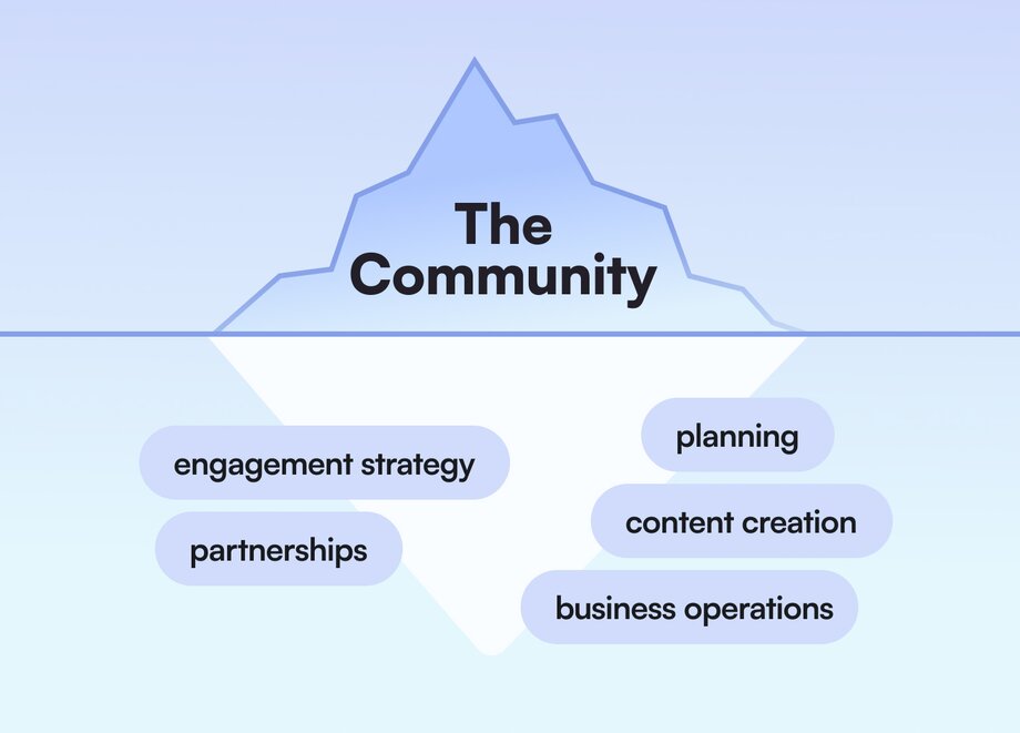
It’s tempting and natural to focus and over index on visible signals—comments, likes, posts—but those are just one part of the story. Consider lurkers—members who log-in and consume content but don’t publicly participate, or DMs—meaningful conversations between members you may never be privy to.
That’s where analytics comes in. Analytics give you an objective, complete look into where, when, and how your members are engaging. From here, you can assess what’s working and what’s not, so that you can figure out where you want to go and build a plan to get there.
Important caveat: Analytics can tell you what your members are doing—or not doing—but it won’t tell you why. And you need both to build a cohesive strategy. (That means talking to members! And using those gut instincts of yours).
Check out Circle's community analytics for everything you need to monitor member activity, engagement, and traffic. And, if you're not yet a customer, get started with your free 14 day trial today.